Challenge
Just as users can buy all kinds of items online, such as clothing, footwear, and food, it is now also possible to purchase health, car, and all kinds of insurance through innovative websites such as our client's. With just a couple of clicks, users can create their policy quote and make the corresponding payment without leaving their homes.
But this insurance company needed to enhance its mobile application, so that it would be as functional as its web application. That is why they turned to Rootstack with the need to improve the appearance of their application, also adding a couple of functionalities to raise the quality of the service provided to their affiliates.
Our solution
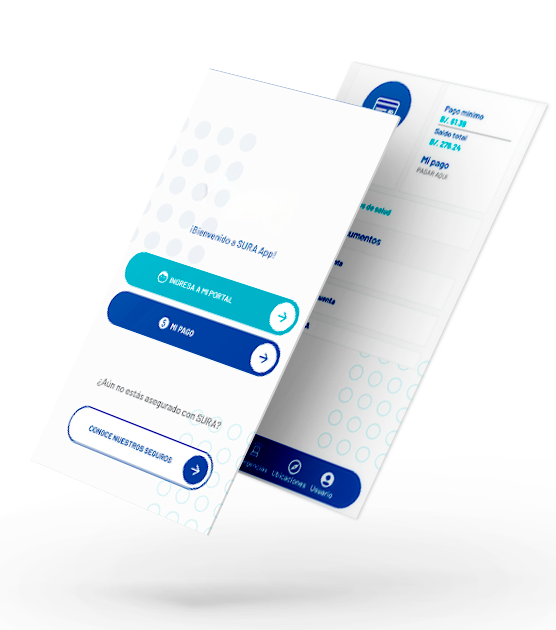
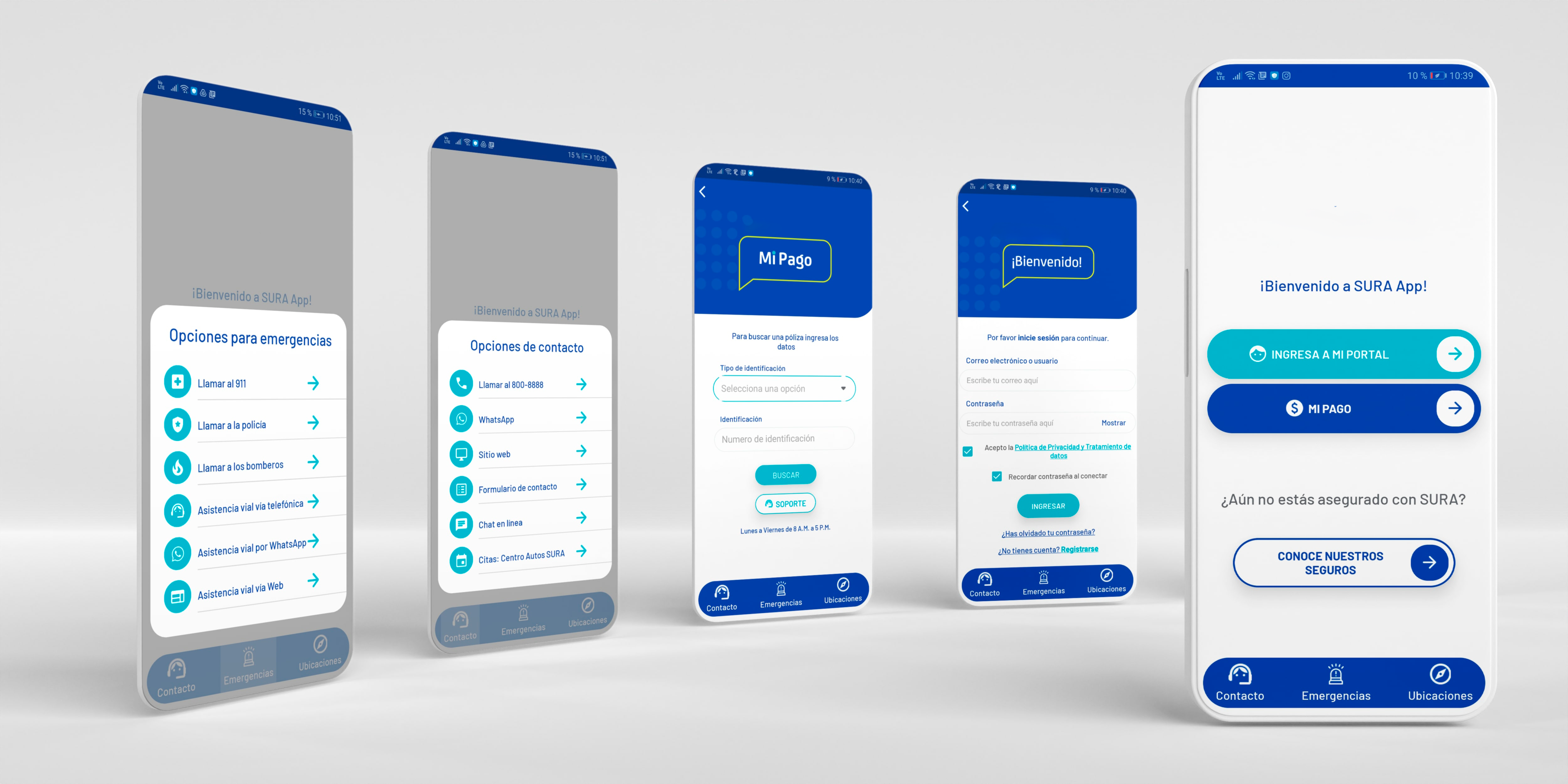
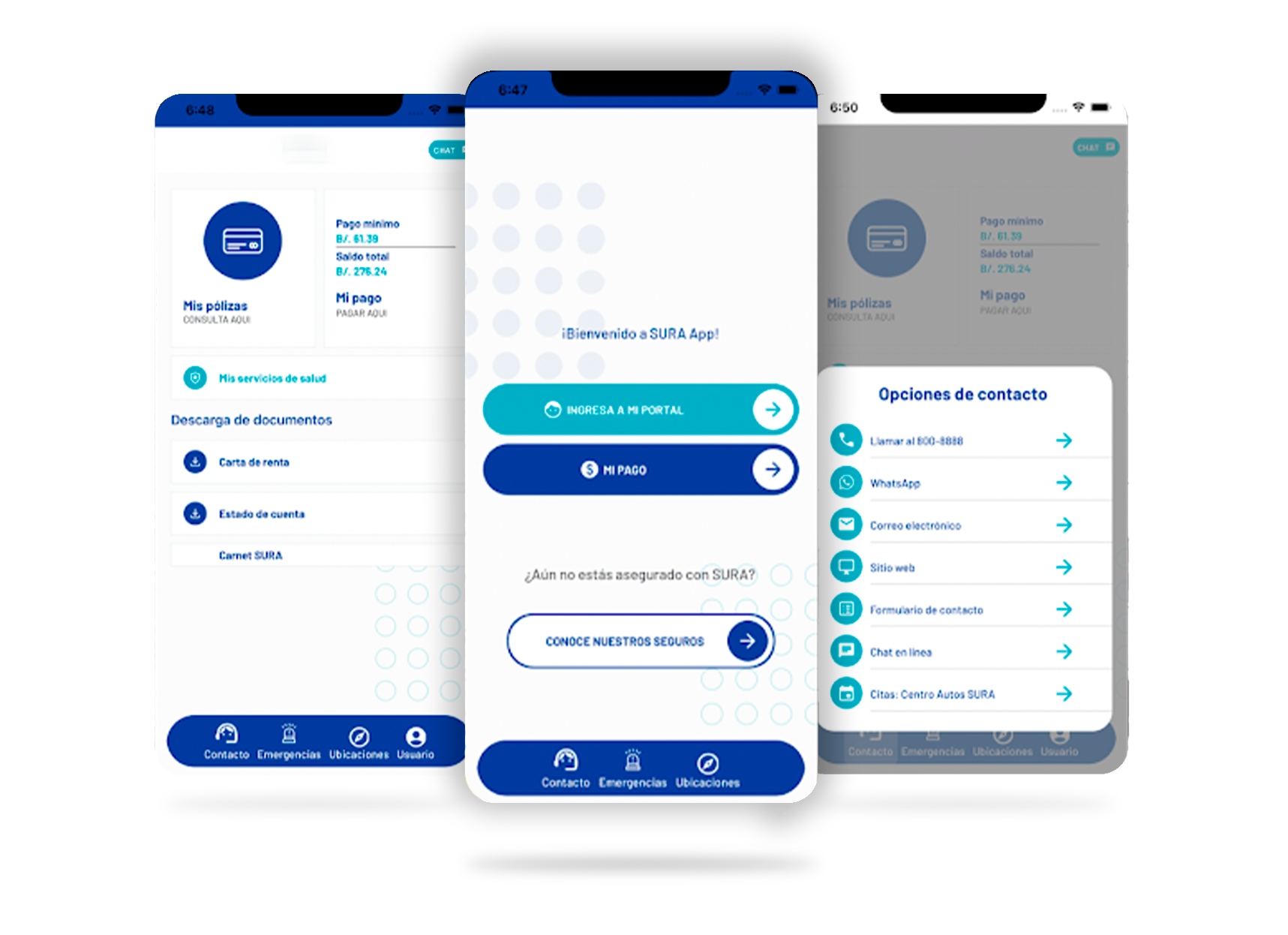
The UX experts from our Rootstack team evaluated the existing mobile application and made substantial improvements to the graphical interface, modernizing the design and positively transforming the user experience, which translates into greater user satisfaction and conversions.
The client needed the mobile application to be cross-platform and we succeeded, making it work optimally on both iOS and Android devices, covering two of the main operating systems in the mobile device market. Features such as facial and fingerprint recognition were also incorporated, adapting to the characteristics of the most modern smartphones.
What we did was reorder the elements that the application showed on the screen with a more functional and user-friendly design, since there were buttons and certain functionalities that existed, but that went unnoticed by the user due to an ineffective and confusing distribution.

With these improvements, we managed to restore the vitality of the SURA mobile application, now showing a powerful and functional interface, attractive to users and with well-defined functions, allowing the insurer's clients to carry out their transactions easily and without drawbacks.
Now, users are faced with a graphical interface in which white spaces predominate, complemented by details in blue and light blue that define our client's color palette. The strategic arrangement of the visual elements directs the user's navigation, guiding him in the search for what he needs in the simplest and most uncomplicated way.
- Integration with Clinic Web
We also work on the integration between the SURA mobile application and Clinic Web, a service that offers consultations by video call and chat with a large staff of doctors and specialists in various areas. With this functionality, the user will be able to access fast and quality medical care without leaving home, just by using the insurer's app.
In this way, our client takes a step forward as an insurance company, not only offering its users the classic policies, but also generating loyalty by allowing its clients to access doctors through its platform when they need it most.

Technology
The technology used in this project was Xamarin, a powerful open source platform that allows building native and high-performance applications for iOS, Android, Windows, among other operating systems.
At Rootstack, we specialize in mobile application solutions, creating modern and innovative platforms for our clients. We have more than 10 years of experience in this industry, with more than 300 projects successfully completed for more than 200 clients around the world. Start the digital transformation of your company now!

