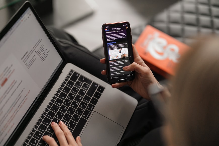
Perhaps one of the most satisfying experiences in the digital world is when we download a mobile application, use it, and the platform seems to understand us. It is as if the application could guess our needs or as if it anticipated them: before we can think about where the "Pay" button is inside the app, the interface is already intuitively showing you the area where it is located option.
The opposite case also happens: we want to throw our phone or mobile device into a deep lake when applications are slow, when they throw errors or when they simply do not respond to what we need. The only element of these scenarios, both positive and negative, is the UX design.
What is UX design?
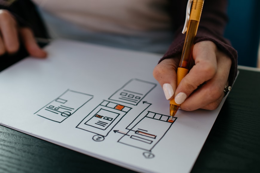
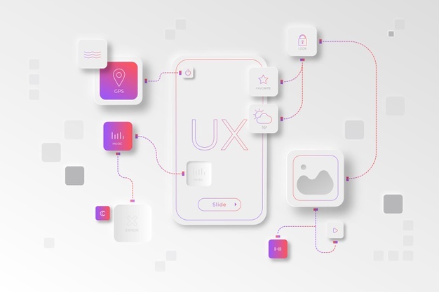
If this is the first time you hear this term, we will explain what UX design is: it is about creating software, web pages and mobile applications that offer an optimal user experience to those who browse these platforms.
“UX design is the process design teams use to create products that deliver meaningful and relevant experiences to users. This implies the design of the entire process of acquisition and integration of the product, including the brand, design, usability and function aspects ”, explained the Interaction Design Foundation on its website, in a specialized article on this subject.

A mobile application could have been developed with the most modern technologies, but if its design is not user-oriented, it will be a total failure. The objective of all software development should be the creation of a positive and friendly user experience for the user, so that they connect more with the platform and the company that is offering their product or service there.
Keys to UX design in mobile application development
There are many types of mobile applications, with many similarities and differences between each one: but whatever the type of mobile app is, all of them must have an optimal UX design designed to offer the user everything they need. That is, that navigation flows in an agile, natural and harmonious way and that it is not confusing or overwhelming.
Nick Babich, the editor-in-chief of the UX Planet portal, explains it like this: the usable and the intuitive should prevail in the development of mobile applications. “If the application is not usable, it has no real value to the user and he has no reason to use it. But if the mobile app is useful, but requires a certain effort to use it, the user will have no problem learning ”, he explains in an article.

Precisely, he explains some of the most important keys in the UX design of a mobile application:
Don't overload the interface
As much as we think that the more elements in the mobile application, the more useful it will be, it is the opposite: overloading the graphical interface with too many options and elements will cause confusion and fatigue in the end user. "It's important to get rid of anything in a mobile layout that isn't absolutely necessary, because reducing clutter will improve understanding," the UX Planet article said.
He recommends that there be only one “main action per screen”. That is, for each screen there is only one main action suggested for the user, to motivate him to do it without distractions.
Prioritize the elements
Now that we know that it is best not to overload the interface, the ideal is that during the development of the application the elements that are going to be displayed on the screen should be prioritized. "Keep the features highly focused on the core goals and refine the design by analyzing which features the user will use most often and then try to make those features intuitive and enjoyable", TopTal experts explained in an article posted on their website.

Button and text size
Another no less important aspect is the size of the text, the font used and the size of the buttons of the mobile application. A UX designer must strive to make the text displayed on the screen legible and clear for the end user. “Font sizes of at least 11 points are recommended to reduce eye strain. Clean, easy-to-read typefaces like Google's Roboto and Noto or Apple's new San Francisco font are great options to explore”, they also reported on TopTal.
And as for the buttons in the mobile app, experts propose that they be at least 7-10mm, adjusting to the average width of the fingertip. With this, the user experience will be much more positive since it will not be cumbersome to interact with the screen and its functionalities.
Pay attention to the size of the screens
Mobile devices have screens of different sizes, so mobile application development and UX design have to go hand in hand to fit user navigation. "Restructure the information, pay attention to the thumb areas, decrease clicks (especially with e-commerce) and pay attention to the login process, which can often be frustrating", they added.

There are many ways to develop a mobile application, everything will depend on the needs of the company and the software engineers running the project. What is invariable are these UX design keys to deliver a sensational user experience. They apply to all kinds of projects.
Do you need a mobile app developer? At Rootstack we handle +50 technologies with which we have developed more than 300 successful projects. We are experts in mobile application development and UX design. Contact Us!
We recommend you on video

